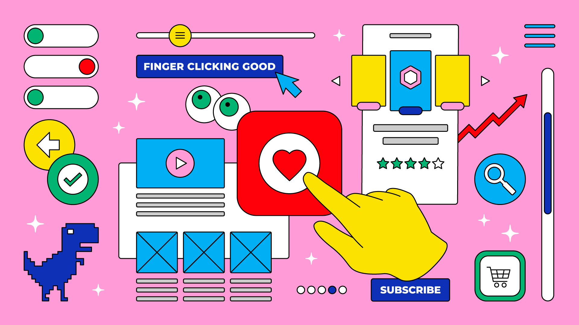
Four UX design conversations you should no longer be having
Written by: Ivan Langham, Designer
Illustration by: Ivan Langham, Designer
With the pace of change in our digital world, it can be hard to keep up with exactly what current design best practice is. By the time you finally wrap your head around the best way to approach that next product build or update, the rules have changed again. It’s not surprising that people are confused and frustrated when told that thing they learned during an online conference six months ago is now old hat.
So let’s put to bed a few of the things that seem to come up again and again – with four UX design misconceptions you no longer need to be discussing.
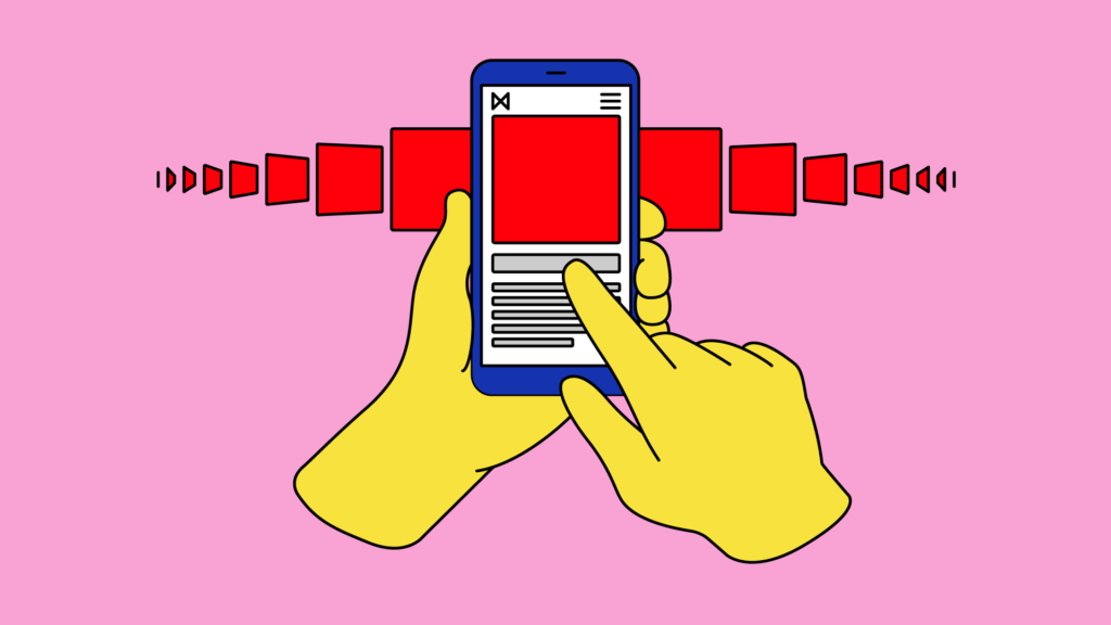
“Users don’t like to scroll”
When web design was in its infancy, keeping all the important stuff ‘Above the fold’ was best practice. However, we’re now a decade into platforms like Facebook and Instagram, which have trained us to scroll and swipe relentlessly. From a homepage to an email, whatever digital experience you are developing, ‘scrolling’ or ‘swiping’ should not be a taboo discussion.
Yes, first impressions are important. Yes, there is a time and place to keep it short and sweet. But thinking that your users are too lazy to reach the bottom of the page is outdated. The important thing to remember is that if your content is enticing and relevant, users will engage.
There are lots of different ways to create and display engaging content, but some quick wins could include: keeping the copy concise and clear; leaning on the power of photography; graphics and video to draw the eye; and bringing elements to life through micro animations and parallax effects.
Apple and Google have been embracing the scroll for years – just look at their product sites for iPhone and Pixel
“Users only know to click on big buttons”
We’ve all seen the data that users can’t resist a nice, big button. And of course the CTA (call-to-action) is important on any user interface. However, when it appears too many times on a page, its eye-catching power is taken away.
Interactivity comes in many different visual forms, which users have grown to understand. When your mouse cursor hovers over something clickable, it turns into a hand – the simplest interaction there is. Iconography is a common form of navigation – think of the shopping cart, magnifying glass or even the abstract “hamburger” menu icon (3 horizontal lines on top of each other).
Yes, go ahead and use that big beautiful button, but use it wisely and sparingly to maximise its effectiveness. Always consider the user journey and hierarchy of message before flooding the page with a button under every piece of content. Chances are, there is a better way. When in doubt, conduct some AB testing to see what your users are drawn to.

“The ‘mobile-first’ approach is best practice”
Starting with a mobile approach means that you consider this user journey to be more important than any other device. In most cases, the data would suggest a broad split of users across varying sizes of smartphones, tablets, laptops and desktops.
A more useful approach is ‘responsive design’ – where your content adjusts automatically to ensure consistency across devices. During design and development, no one device is favoured over another. Each component on the page, whether it be copy, imagery or even a data capture form, is optimised for whatever screen the user is experiencing.
“If it’s not broken, don’t fix it”
It makes sense to leave what’s working, and to change what isn’t – right? Not always. In fact, it can be much more effective to anticipate the changing environment and move with it than to constantly chase it year after year.
Let’s take a suite of welcome emails for example. The results are good, so why update or redo them the next year? Well, as we’ve seen, the world does not stand still. Design trends evolve, new technology emerges, and consumer behaviour constantly shifts. Move with that change instead of banking on what worked last year during a different environment: set the pace and get out in front.
These changes don’t have to be root and branch, and sometimes an evolution is enough. Respect the experts in relevant fields and execute based off clear data, insights and research. As always, rely on proper AB testing to refine the details.